

Data visualization: choose the right visualization with the help of Qlik
Companies collect a lot of data. Just think of all the information you gather through your website, customer data, geo data, sales data, and so on. In this world of ”data madness” we all want to gain important insights in no time. More and more companies are therefore using data visualization in business intelligence tools such as Qlik.
Data visualization is the communication of information (data) in a clear and effective way, using graphical tools. In data visualization the use of colors and shapes are important as these help us quickly grasp notable insights. However, there are dozens of visualizations available and choosing just the right one for the cause can be difficult. Think of pie charts, line charts, (pivot) tables, bar charts, KPI’s and so on. How do you choose the optimum visualization to get the answer of your question? And how can a BI-tool like Qlik help you, as a user, choose the right one?
”Visualizing data makes analyzing a lot easier and more fun”
MAKING ANALYZING MORE STRAIGHTFORWARD
A good visualization will give you the scope to analyze your data at a glance. Each of your visualizations provide an answer to one of your key questions, which may be crucial to your business. Now you can easily zoom in on problem areas and quickly take actions that directly will affect your results. Analyzing the data becomes a lot easier and more fun.
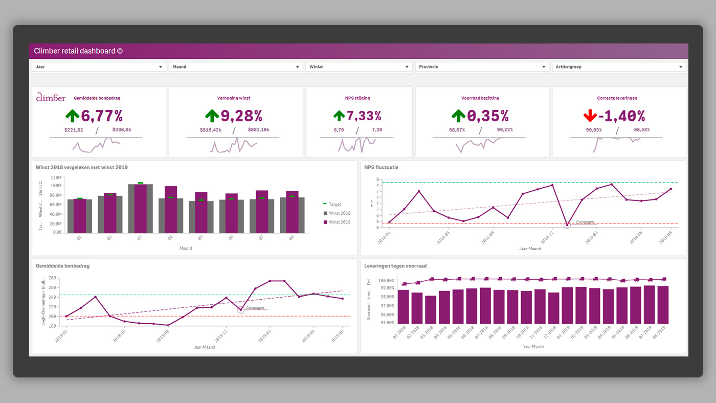
One of the best and most sustainable ways to quickly gain valuable insights from your data is combining visualizations to a dashboard. A major additional advantage is that visualizations in tools such as Qlik only need to be designed once. As an analyst, you will therefore no longer be busy creating insights on a daily basis, but instead get the insights every day by simply pushing a button. This will allow you to prepare in advance for what you see happening in, for example, your production process or at one of your stores.
TAKE IN CONSIDERATION BEFORE CHOOSING A VISUALIZATION
The visualization chosen should, together with the underlying data, tell a story of how the data influences your company and employees (storytelling). The story told by the visualization must be easy for the user to understand and reveal important insights immediately. This of course requires a certain amount of data literacy from the user.
“In addition to properly visualizing the data, it’s very important that the analysts possess a certain amount of “data literacy”. Only the correct interpretation and understanding of the insights ensure that the team can convert the insights into a valuable action plan.”
Want to know more about data literacy and the importance of it to your company? Click here to watch the webinar with Qlik’s Jordan Morrow on data literacy.
A reliable, useful and sensible visualization must take four factors in consideration. It should:
- contain correct data
- be relevant to the user
- be easy to use
- be attractive / clearly visualized
3 STEPS TO GUIDE YOU TO THE OPTIMAL VISUALIZATION
The first step, and at the same time the most important aspect when choosing the right visualization, is of course that you understand the data that you intend to use. Lacking knowledge of this will make it very difficult to create a valuable visualization.
Useful tips!
1. Determine the goal
Before you start creating a visualization, make sure that the purpose of the visualization is clear. This will help you determine how many measured values and dimensions you need, which in turn automatically will give you direction in choosing a visualization. In addition, always try to imagine what the user wants to see.
2. Use the right colors
In a visualization it’s important that the colors signal whether something is important and therefore should attract the attention of the user. You can use ”alarm colors” e.g. red for decrease in sales, or green for achieving the target of the marketing campaign.
3. Keep it simple
Try not to show too much information in one visualization. You don’t want the user searching for the answer to his question. Would you like the user to have the option to see more details? Use the drill-down function to enable this.
Source: Qlik Demo
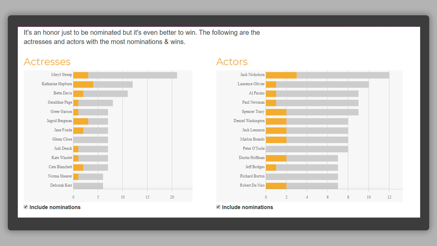
These visualizations exemplify correct use of our tips
- The goal: to compare the number of Oscar nominations with the actual wins per actor / actress
- The colors: orange attracts attention, here you can quickly see how often an actor / actress won an Oscar
- Keep it simple: no excess data in the visualization, making the insights visual at a glance
THE MOST USED VISUALIZATIONS
Each graph excels in visualizing data in a different way for a different purpose. At this moment, the most commonly used visualizations are still the ”golden oldies”, the bar chart and the line chart.
The bar chart
Shows a trend in the form of bars / columns, possibly over time (e.g. last year versus this year) and per dimensional value (e.g. per category). You can change the order – to see the most relevant column first.
The line chart
Shows a trend where the x-axis can have a large number of data points. This graph is useful to display, for example, revenue of the current year over various data points, in the form of a line. A line can easily be added to the visualization, for example, one that displays data from last year. This allows the user to quickly compare trends with each other.
In addition to these valuable classics, there are of course other visualizations that are frequently used. Qlik has developed a practical step-by-step plan for this, which helps you with your choice and keeps the various visualizations organized.
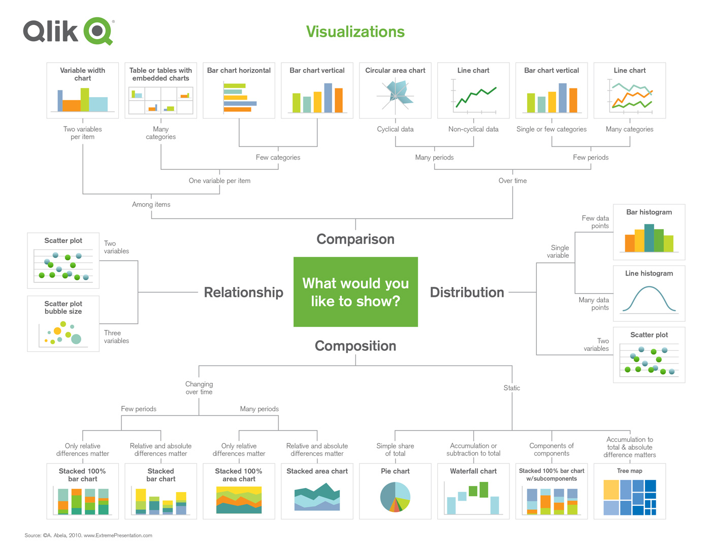
VISUALIZING DATA WITH THE HELP OF QLIK
The Business Intelligence tools QlikView and Qlik Sense are part of Qlik’s offering. These BI-tools provide different options of data visualizations and the possibility to combine them into dashboards and reports. One of the advantages of Qlik is that the tool also can advise you on which visualizations to use. The Qlik Insight Advisor provides a starting point for you to explore your data and create visualizations. The Qlik Cognitive Engine looks at the available fields you want to visualize. Taking this information in account, the Insights Advisor gives several suggestions of visualizations and you then determine which one gives you the best insights.
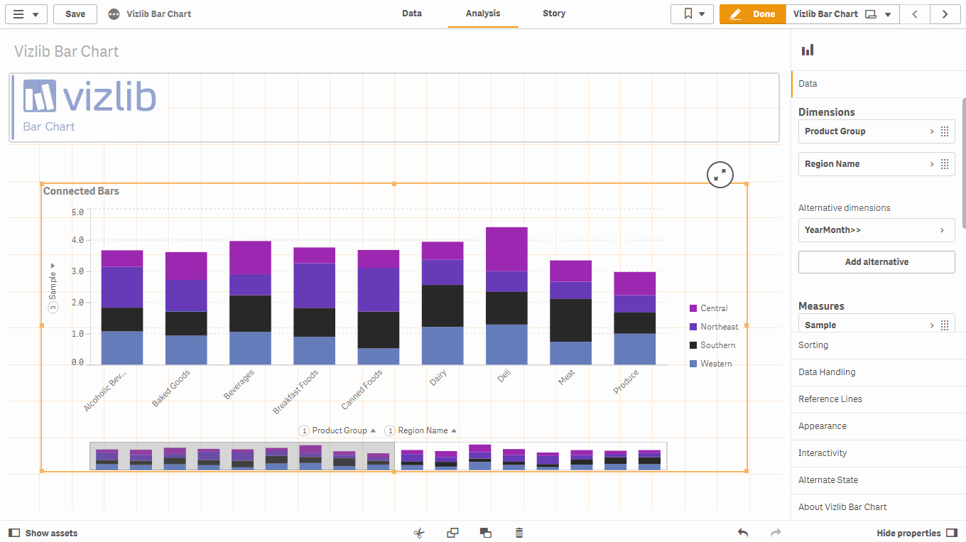
ADD FUNCTIONALITY TO QLIK SENSE WITH VIZLIB
Qlik Sense native offers the user options to build dashboards and gives direction and unity. With Vizlib’s extensions you can easily add smart, customized functions and visualizations to Qlik Sense and enhance the user experience with advanced capabilities and rich design options, making Qlik Sense even more versatile and user-friendly!

Writer: Milou Bijl – BI Consultant Climber
News

What’s New in Qlik Cloud – June 2026
This month’s release introduces new visualisation objects, strengthens the Qlik MCP server, improves automation controls, and refines the experience for administrators and app developers.
>> Read more
The AI Reality Tour Online 2026
Couldn’t attend any of the in-person events this year? No worries! You can now watch the online material whenever and wherever you want in the on-demand format. Register and enjoy!
>> Watch now
Creating Data Agents in Microsoft Fabric
Microsoft Fabric data agents are one of the more practical AI features now appearing in the platform. Read on for more insights on how to turn trusted data into useful conversations.
>> Read more